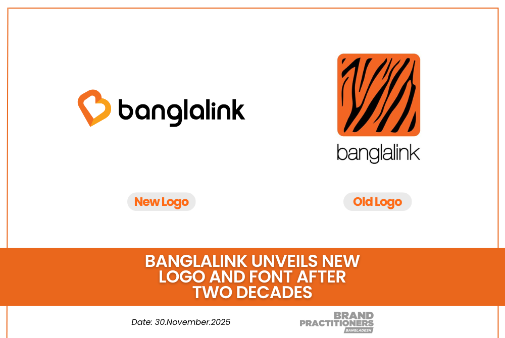
Banglalink has officially refreshed its brand identity after almost 20 years, bringing a completely new look to the telecom giant.
The company has moved away from its iconic tiger-stripe logo and introduced a soft, minimal and modern design centered around a moving B shape created with multiple orange shades.
Along with the logo refresh Banglalink has also updated its font. The previous font was more angular and hard while the new one feels soft round and easier to read. The updated font looks clearer on digital screens and gives the overall brand a more friendly and modern appearance. According to brand observers the new font has been designed to match the soft shape of the new logo creating a more unified visual identity.
Industry insiders believe this change reflects Banglalink’s push toward a more human centric and emotion driven communication style especially with its new slogan “Aponar Jonno”. The new identity signals a shift from the earlier power-driven tiger symbol to a softer customer first approach.
Read more: Three Individuals and Four Organizations Honored at 10th BRAC Bank & The Daily Star ICT Awards
With digital adoption rapidly rising in Bangladesh this modern rebranding is seen as a strategic move to connect better with today’s mobile and internet users. As the new look rolls out nationwide consumer reactions will determine how strongly the refreshed Banglalink resonates in the market.


