How colors affect people’s feelings and their perceptions of a brand is discussed in Brand color psychology. Colors have the power to influence our mood and purchase desires. Businesses can elicit positive emotions, excitement, or curiosity in their products from clients by selecting colors carefully. Using the right colors in ads or products can make customers desire to buy something or learn more about it.

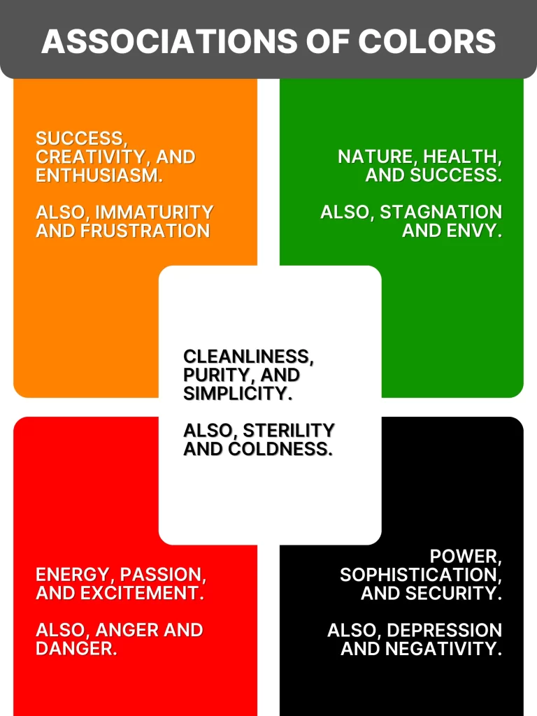
Associations of Colors
- Orange: Success, creativity, and enthusiasm. Also, immaturity and frustration.
- Black: Power, sophistication, and security. Also, depression and negativity.
- Green: Nature, health, and success. Also, stagnation and envy.
- Red: Energy, passion, and excitement. Also, anger and danger.
- White: Cleanliness, purity, and simplicity. Also, sterility and coldness.
Examples of Color Use in Brands:
Nike – Black and White:
Nike uses black to portray strength, refinement, and elegance, while white provides a feeling of clarity and simplicity. The brand’s dedication to performance and innovation is emphasized by this combination.
Cadbury – Purple:
Cadbury takes advantage of purple to evoke luxury, quality, and indulgence. The rich purple packaging suggests a premium product, appealing to customers who are seeking something special.
Pathao – Red:
Pathao uses red to symbolize energy, excitement, and action, reflecting its fast-paced ride-sharing and delivery services. The vibrant color lets the brand easily recognizable and shows a sense of urgency and motion.
Banglalink – Orange:
In keeping with the brand’s idea of youth and vibrancy, Banglalink employs orange in its branding to stand for inventiveness, zeal, and kindness. This is especially appealing to younger people.
Teer – Red, White, and Yellow:
Teer uses red to stand for power, energy, and strength in order to draw attention and show dependability and confidence. This color scheme instills a sense of urgency and increases hunger. White highlights the quality and clarity of Teer’s food goods. White balances red by adding purity, cleanliness, and simplicity. Customers are more likely to respond positively to the overall appeal and feel warm and uplifted by the touch of yellow.
Kazi & Kazi Tea – Green and Earth Tones:
Kazi & Kazi Tea uses green to draw attention to its organic, natural, and sustainable attributes, appealing to customers who are concerned about their health and the environment. Green is a color associated with health, the environment, and nature. Brown and other earth tones highlight the brand’s organic and pure tea goods while reaffirming its relationship to nature and dependability.
IFIC Bank – Green:
IFIC Bank uses green to symbolize growth, stability, and trust—essential qualities for a financial institution—helping to build a trustworthy and reliable image.
ShareTrip – Blue and White:
ShareTrip, a leading travel agency in Bangladesh, uses blue to represent trust, reliability, and professionalism, essential qualities for a service-oriented business in the travel industry. When clients are making vacation plans, the color blue reassures them by invoking a sense of stability and serenity. By adding a dash of clarity and simplicity, White improves the user experience by making information simple to locate and understand. This combination encourages users to plan their travels through ShareTrip by fostering a sense of confidence and security.
By understanding and strategically using color psychology, both Bangladeshi and international brands effectively communicate their values, connect with their target audience and stand out.
Color psychology is a key part of branding that influences customer perceptions and behavior. By carefully choosing colors that align with your brand values and resonate with your target audience, you can create an effective and engaging brand identity.


