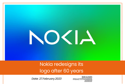
Nokia redesigns its logo after 60 years
Nokia, the former powerhouse in phone-making, has introduced a new brand identity for the first time in almost 60 years. The updated logo was revealed on Sunday, just before the official launch of Mobile World Congress Barcelona.
The previous logo’s recognizable typeface and “Yale blue” have been replaced with a more modern and digital style, indicating a significant change in the company’s overall business strategy.
There was the association to smartphones and nowadays we are a business technology company,” Chief Executive Pekka Lundmark recently said in an interview with Reuters.
Nokia’s main business focus has shifted from manufacturing and selling phones to selling equipment to other businesses. However, the company still aims to grow its service provider business, which involves selling equipment to telecom companies.


