PURCHASE, N.Y. October 27, 2025: PepsiCo has revealed its first corporate logo redesign in nearly 25 years marking a major strategic shift from a “house of brands” to a “branded house” structure that unites its 500-plus products under a single consumer-focused vision.
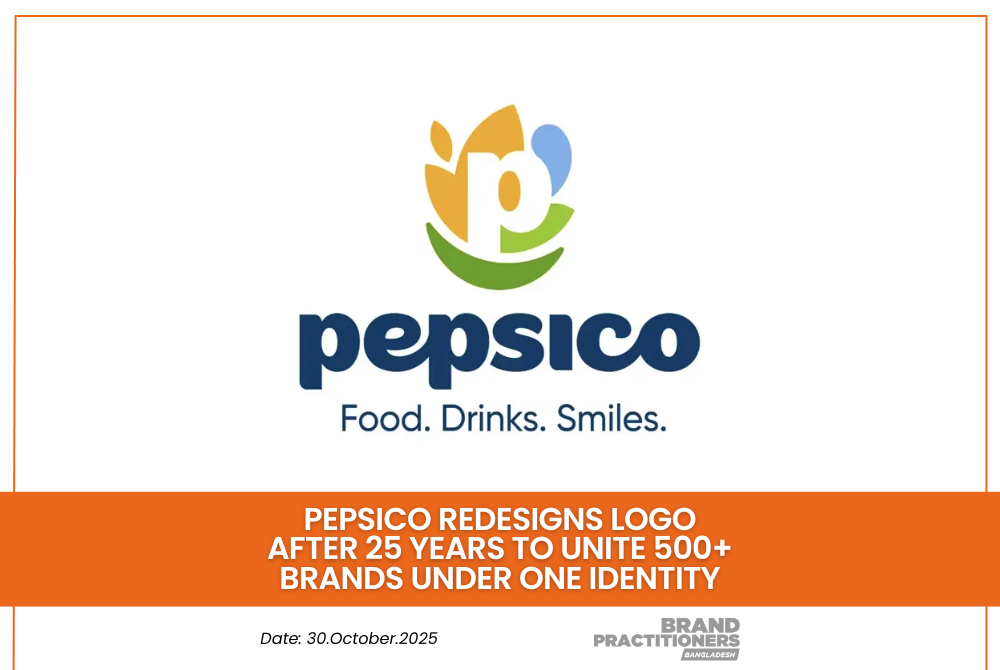
The new identity centers on a stylized “P” emerging from a smile framed by a leaf and a water droplet symbolizing the company’s dual focus on food and beverage. The refreshed logo replaces the familiar multicolored globe introduced in 2001 and reflects PepsiCo’s ambition to appear as one cohesive global brand.
According to company data, only 21 percent of consumers can name another PepsiCo brand besides Pepsi. With household names like Lay’s, Doritos, Mountain Dew, Gatorade, and Quaker under its umbrella, the rebranding aims to strengthen master-brand recognition and highlight the company’s shared purpose.
Read more: Funtastic Hebby Energy Half Marathon 2025” Successfully Held at Hatirjheel
“Our new identity boldly reflects who we are in 2025, a company with expansive reach aiming for positive impact across the globe and an unmatched family of beloved food and drink brands,” said Ramon Laguarta, Chairman and CEO of PepsiCo.
A Symbol of Transformation
The redesigned emblem introduces an approachable lowercase typeface and a natural color palette inspired by the soils that nourish our foods and the refreshing hues of our drinks. The central smile now embedded within the logo’s “P” aligns with PepsiCo’s mission statement of creating more smiles with every sip and every bite.
The new tagline “Food. Drinks. Smiles.” will appear beneath the logo across digital physical and packaging assets starting in early 2026.
Read more: Case Study: Brussels Airlines Reunites Original Cast After 15 Years for Sequel
Jane Wakely, Chief Consumer and Marketing Officer, described the redesign as more than a visual refresh:
“Our new look isn’t just a logo; it’s a symbol of transformation that captures the optimism, ambition and energy of PepsiCo in 2025 and beyond. By putting smiles at the heart of our identity we’re signaling our deep obsession with consumers.”
Rollout and Future Direction
The new identity has already been implemented on PepsiCo’s official website and global social media platforms including LinkedIn, Instagram, YouTube and TikTok. Product packaging, retail signage and office branding will adopt the new mark beginning January 2026.
The redesign also aligns with PepsiCo Positive (pep+), the company’s sustainability framework that focuses on regenerative agriculture, emission reduction and responsible packaging innovation. Laguarta emphasized that the new logo reflects the next chapter in PepsiCo’s journey to become faster, stronger and better positioned for sustainable growth.
Read more: SWISH Kitchen Burner Brings Power, Safety, and Luxury to Everyday Cooking
By moving toward a branded house strategy similar to companies like FedEx, PepsiCo aims to strengthen its corporate name recognition while connecting its diverse global portfolio under one unified identity.
As the company ushers in this visual and strategic evolution, its message remains simple yet powerful: This is PepsiCo: Food. Drinks. Smiles.


